

Why Your Healthcare Dashboard Needs a Semantic Layer
Here’s a scenario I’ve seen play out at every healthcare organization I’ve worked with: three people need to answer the same question. “What was our total spend on cardiology services last quarter?”
The data analyst opens Tableau and writes SQL that joins claims to providers, filters by service_type = 'Cardiology', and sums allowed_amount. They define “last quarter” as calendar quarter.
The finance team opens Excel, connects to the same database, writes a slightly different query. They filter on condition_category instead of service_type because in their mental model, cardiology is a condition category, not a service type.
The product manager asks engineering for a dashboard. An engineer writes a third query, this time joining through a different path and accidentally double-counting claims because of a one-to-many join they didn’t account for.
Three people, three numbers, one meeting where nobody trusts the data.
This is the “metrics inconsistency” problem. It happens everywhere, but in healthcare it’s especially dangerous because these numbers drive decisions about care quality, provider payments, and regulatory reporting. If your HEDIS measures are off because two analysts define “member count” differently, you’re not just getting a bad dashboard. You’re potentially misreporting to CMS.
I built a healthcare analytics dashboard specifically to demonstrate how a semantic layer solves this. Here’s what I learned.
What Is a Semantic Layer, Actually?
Strip away the vendor marketing and a semantic layer is a simple idea: define your business logic once, in one place, between your database and everything that consumes the data.
Instead of every analyst, dashboard, and API endpoint writing their own SQL with their own interpretation of what “total allowed amount” means, you define it once in a schema file. Every consumer queries through that layer and gets the same number.
This matters more now than it used to because organizations are using more tools simultaneously. You might have Tableau for analysts, a React dashboard for operations, a Slack bot for executives, and an AI agent for ad-hoc questions. Each of those consumers needs the same metrics, and maintaining consistent SQL across all of them is a losing battle.
Generative AI makes it even worse. Humans consuming analytics can spot obvious errors and apply business context to questionable numbers. LLMs don’t have that luxury. Feed an AI agent inconsistent metric definitions and you get confident, wrong answers.
What I Built
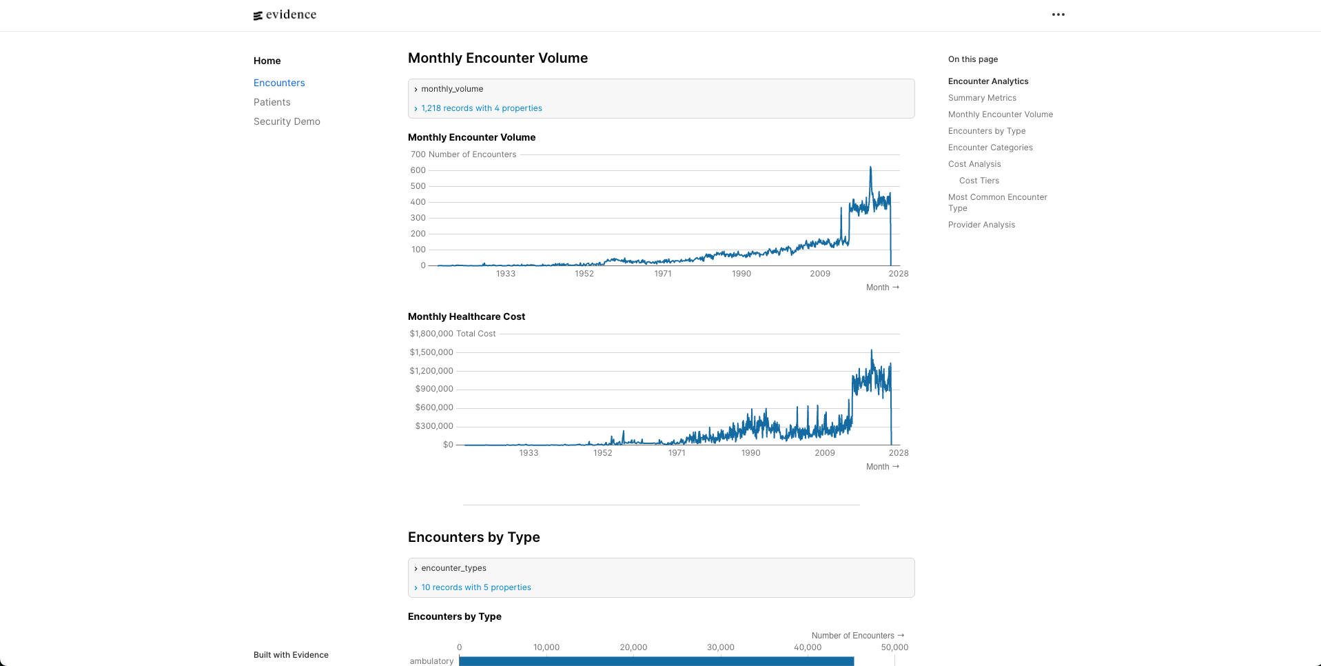
The proof of concept is a healthcare analytics dashboard with three views: a KPI dashboard with trend charts, an interactive explorer with drill-down, and a filterable claims table. The data is synthetic (generated by hand-rolled scripts to simulate realistic claims patterns) and stored in DuckDB.
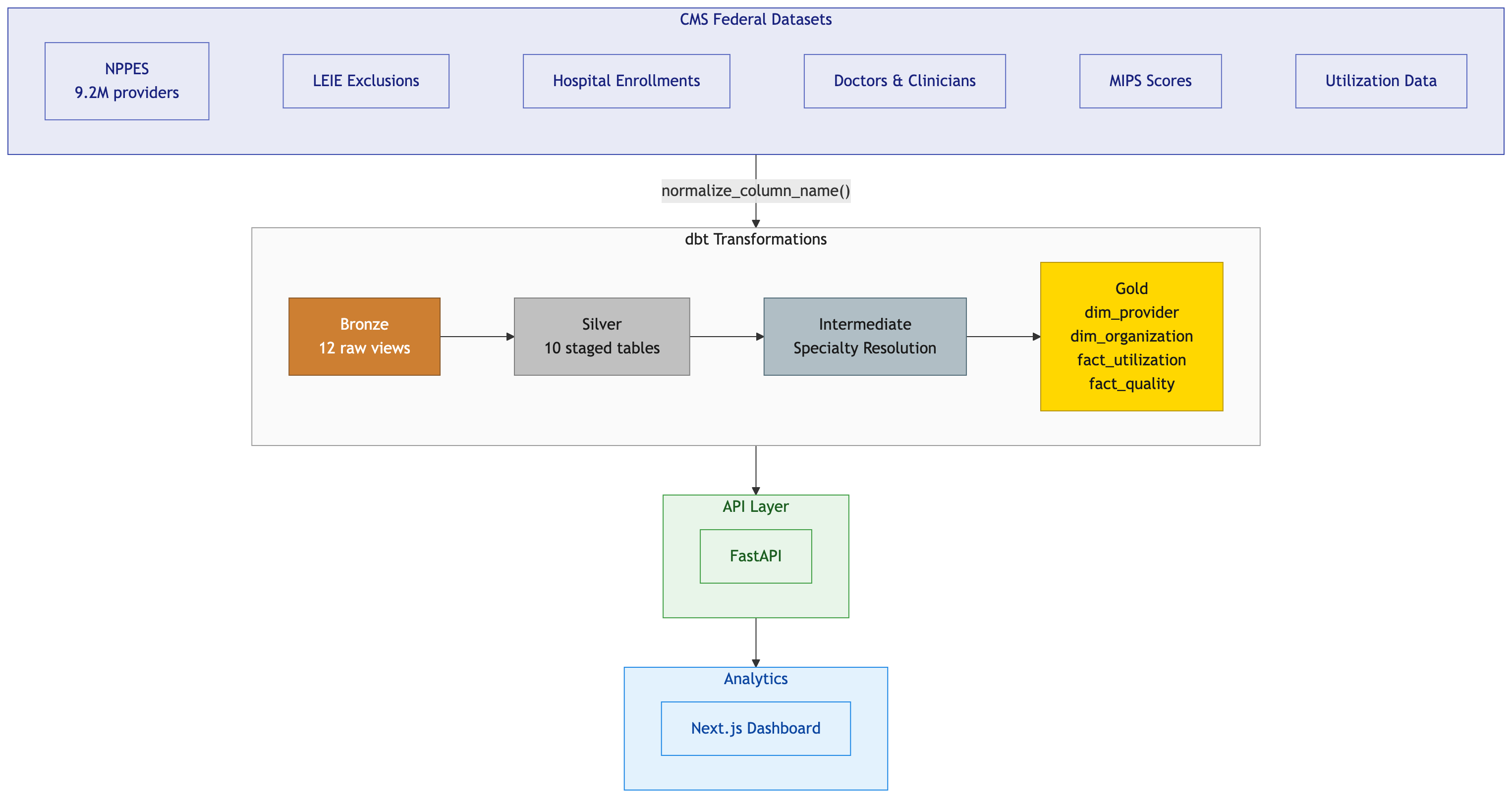
The interesting part isn’t the frontend. It’s the layer between the frontend and the database: Cube.dev.
flowchart TD
    A["Browser<br/>(Next.js + Recharts)"] -->|fetch JSON| B["Next.js API Proxy<br/>(:3000)"]
    B -->|rewrite to localhost:4000| C["Cube.dev REST API<br/>(:4000)"]
    C -->|SQL via duckdb-driver| D["DuckDB<br/>(healthcare.duckdb)"]
The frontend never writes SQL. It asks Cube.dev for measures and dimensions using a JSON query format, and Cube.dev figures out the SQL, the joins, the caching, and the execution.
Here’s a quick demo of the dashboard in action:
The Cube.dev Schema: Where the Magic Happens
Here’s the Claims cube, which is the core of the semantic model:
cube(`Claims`, {
  sql: `SELECT * FROM claims`,

  joins: {
    Members: {
      relationship: `belongsTo`,
      sql: `${CUBE}.member_id = ${Members}.member_id`,
    },
    Providers: {
      relationship: `belongsTo`,
      sql: `${CUBE}.provider_id = ${Providers}.provider_id`,
    },
  },

  measures: {
    totalAllowedAmount: {
      sql: `allowed_amount`,
      type: `sum`,
      title: `Total Allowed Amount`,
      format: `currency`,
    },
    count: {
      type: `count`,
      drillMembers: [claimId, serviceDate, serviceType, conditionCategory],
    },
    memberCount: {
      sql: `member_id`,
      type: `countDistinct`,
      title: `Member Count`,
    },
    avgAllowedAmount: {
      sql: `allowed_amount`,
      type: `avg`,
      title: `Average Allowed Amount`,
      format: `currency`,
    },
  },

  dimensions: {
    claimId: {
      sql: `claim_id`,
      type: `string`,
      primaryKey: true,
    },
    serviceDate: {
      sql: `service_date`,
      type: `time`,
    },
    serviceType: {
      sql: `service_type`,
      type: `string`,
    },
    conditionCategory: {
      sql: `condition_category`,
      type: `string`,
    },
    // ... plus diagnosisCode, procedureCode, allowedAmount
  },
});
This is the single source of truth. totalAllowedAmount is SUM(allowed_amount). Period. Every consumer that queries through Cube gets this definition. The Tableau user, the React dashboard, an API call, a future AI agent: they all hit the same logic.
A few things worth noting in this schema. The joins section declares that Claims belongsTo both Members and Providers. This means Cube.dev knows the relationship cardinality. When the frontend asks for Claims.memberCount alongside Providers.providerType, Cube generates the correct JOIN without double-counting. That one-to-many bug from our scenario earlier? It can’t happen, because the join semantics are defined once and enforced by the layer.
The drillMembers on the count measure is also important for the UX. When a user clicks a bar in the dashboard to drill down, Cube.dev knows which dimensions to expose for that measure. The frontend doesn’t hardcode drill paths; the semantic model declares them.
The Members cube adds calculated dimensions that would otherwise get redefined in every query:
cube(`Members`, {
  sql: `SELECT * FROM members`,

  dimensions: {
    ageGroup: {
      sql: `CASE
        WHEN DATE_DIFF('year', birth_date, CURRENT_DATE) < 18 THEN 'Under 18'
        WHEN DATE_DIFF('year', birth_date, CURRENT_DATE) < 35 THEN '18-34'
        WHEN DATE_DIFF('year', birth_date, CURRENT_DATE) < 50 THEN '35-49'
        WHEN DATE_DIFF('year', birth_date, CURRENT_DATE) < 65 THEN '50-64'
        ELSE '65+'
      END`,
      type: `string`,
      title: `Age Group`,
    },
    // ... plus memberId, gender, birthDate, state, city
  },
});
Age bucketing logic like this is a classic source of inconsistency. Every analyst who needs age groups writes their own CASE statement with their own cutoffs. Here, it’s defined once. If the organization decides to change the brackets (say, splitting 65+ into 65-74 and 75+), you change one file and every dashboard updates.
Pre-Aggregations: Why Cube.dev Specifically
There are other approaches to building a semantic layer, including warehouse-native options from Snowflake and Databricks, and transformation-layer tools like dbt’s MetricFlow. I chose Cube.dev for this project because I’m building an interactive application, and Cube’s killer feature is its pre-aggregation and caching engine.
When a user clicks a bar chart to drill down into cardiology claims by provider, they expect a response in milliseconds, not seconds. That’s where pre-aggregations come in.
preAggregations: {
  // Monthly rollup for dashboard trends
  monthlyTrends: {
    measures: [totalAllowedAmount, count, memberCount],
    dimensions: [],
    timeDimension: serviceDate,
    granularity: `month`,
    refreshKey: { every: `1 hour` },
  },

  // Service type breakdown
  byServiceType: {
    measures: [totalAllowedAmount, count, avgAllowedAmount],
    dimensions: [serviceType],
    refreshKey: { every: `1 hour` },
  },

  // Monthly by service type for drill-down
  monthlyByServiceType: {
    measures: [totalAllowedAmount, count],
    dimensions: [serviceType],
    timeDimension: serviceDate,
    granularity: `month`,
    refreshKey: { every: `1 hour` },
  },

  // Monthly by condition for drill-down
  monthlyByCondition: {
    measures: [totalAllowedAmount, count],
    dimensions: [conditionCategory],
    timeDimension: serviceDate,
    granularity: `month`,
    refreshKey: { every: `1 hour` },
  },
},
Each pre-aggregation tells Cube to pre-compute a specific combination of measures, dimensions, and time granularity. Cube builds these rollup tables in the background and stores them in Cube Store, its own columnar storage engine. When the frontend queries a matching combination, Cube serves from the pre-aggregated table instead of scanning millions of raw claim rows.
The monthlyTrends pre-aggregation powers the dashboard’s main trend chart. It pre-computes total spend, claim count, and member count at monthly granularity with no dimensional breakdown. The byServiceType and byConditionCategory pre-aggregations power the breakdown charts. The monthlyByServiceType and monthlyByCondition variants support drill-down, where the user clicks a month on the trend chart and wants to see the breakdown for just that month.
Notice that avgAllowedAmount is included in byServiceType but not in monthlyTrends. That’s intentional. Average is non-additive: you can’t compute a yearly average by averaging the monthly averages. Cube.dev is smart about this. It knows avg requires the underlying sum and count to recompute correctly, and it won’t serve a pre-aggregated average from a rollup that would produce incorrect results. It falls back to querying the raw data instead.
For the POC, DuckDB is fast enough on its own. But in production, where you’re querying millions of claims across years of data with multiple concurrent users, the difference between 50ms and 8 seconds determines whether people actually use the dashboard.
The Healthcare-Specific Case
Healthcare has a particularly vicious version of the metrics inconsistency problem, and it goes beyond dashboards looking different.
“Allowed amount” is ambiguous. Does it include denied claims? Adjustments? Coordination of benefits? Two analysts at the same payer can give you different numbers depending on their assumptions. In a semantic layer, you make that decision once and document it.
“Member count” is a minefield. It could mean unique members who ever had a claim, member-months (which matters for PMPM calculations), or active enrollment at a point in time. HEDIS measures are particularly specific about how members are counted, and CMS audits these calculations. In the Claims cube, memberCount is explicitly defined as countDistinct on member_id, meaning unique members with at least one claim. If you needed member-months, you’d define a separate measure with different logic. Both definitions live in the same schema, clearly named, clearly documented.
Regulatory reporting has zero tolerance for inconsistency. When you submit quality measures or cost reports, the numbers need to match across every document. If your star rating calculation uses one definition of “member” and your annual report uses another, that’s an audit finding.
A semantic layer forces you to codify those definitions. They become reviewable, version-controllable, and testable. You can look at the schema file and see exactly how memberCount is calculated. You can put it in a pull request and have a clinical analyst review it before it goes to production.
When You Don’t Need This
I don’t want to oversell it. You probably don’t need a semantic layer if:
- You have one analytics consumer (just one BI tool, not multiple)
- Your metrics are simple aggregations with no business logic
- You pre-compute everything in your dbt transformation layer into final tables
- You’re a small team where everyone already agrees on definitions
You start needing one when multiple tools or consumers query the same data, when metric definitions carry real business logic, or when you need consistent caching and access control across consumers. In healthcare, the compliance angle often tips the scale earlier than in other industries.
What Production Looks Like
The POC proves the architecture. Production would swap out several components:
| Component | POC | Production |
|---|---|---|
| Database | DuckDB (local file) | Snowflake or Databricks |
| Auth | None | Row-level security via Cube |
| Data | Synthetic scripts | Real claims/enrollment feeds |
| Hosting | Local dev servers | Cube Cloud + Vercel |
| Refresh | Manual | Scheduled pre-aggregation refresh |
| Monitoring | None | Datadog via Cube integration |
The semantic layer itself scales well. You’d add more cubes (Enrollment, Referrals, Quality Measures), more pre-aggregations tuned to actual query patterns, and access policies that mask PHI based on user role. Cube.dev supports all of this out of the box, including dynamic data masking and multi-tenant access control.
The harder production problem is getting clinical stakeholders to agree on definitions. The technology is the easy part. Getting a room full of actuaries, clinicians, and data analysts to agree on what “allowed amount” means at your organization? That’s the real project.
Closing Thoughts
The semantic layer isn’t a new idea, but the tooling has finally caught up to the concept. There’s no excuse for letting every analyst write their own SQL with their own interpretation of your metrics.
In healthcare specifically, where the cost of inconsistency ranges from “confusing dashboard” to “audit finding” to “incorrect patient care decision,” a governed metrics layer isn’t a nice-to-have. It’s infrastructure.
The full POC (Next.js + Cube.dev + DuckDB) is three Cube schema files totaling about 200 lines of JavaScript. That’s a small investment for never having to debug why two dashboards show different numbers for the same metric again.
If you’re building healthcare analytics and thinking about semantic layer architecture, I’d love to chat. Find me on Twitter at @karancito.